
Reach Out & Touch
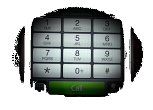
Customers looking at web content on their phones now have come to expect to tap a phone number and then tap CALL. You can insure that this will function across all mobile platforms by adding the above code.
Size Matters
Websites have to be designed for some lowest common denominator. What screen resolution should designers utilize that will satisfy the widest audience? The current thinking is that we are in a transition from 800 pixels wide that is commonly thought to correspond to monitors that have a resolution of 800×600 pixels.
Research seems to suggest that this resolution has fallen to a tiny minority of desktops. In addition we have to consider the scaling issues attendant with smartphones.
Our designs currently specify a width of 920-960 pixels. The lowest common denominator in screen resolutions would be an Ipad and the many inexpensive Netbooks that utilize a native resolution of 1024×768.
A page designed with this width will display properly on 90% of the screens currently in use. Another school of thought is liquid design where the page will adjust to 100% of the screen width. With such a large variety of large monitors your page design can look pretty ridiculous when a nicely formatted 8 line paragraph becomes a single line of text 2560 pixels wide!
For a detailed breakdown of these statistics visit the Browser Statistics Page →
at w3schools.com. They have compiled informative statistics to guide thinking in these questions. There really isn’t a correct answer to this dilemma – it’s an exercise in tradeoffs•
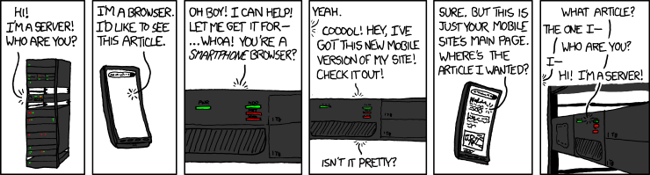
A Picture . . .
. . . is worth a thousand words. Not So Smart. Servers. Phones.
I had a rant about the difficulty of ‘talking’ to smartphones and the difficulties of just what smartphones do with the info you send them, and, well, while indulging in the guiltiest of pleasures – XKCD.COM. – they did all my work for me! Be sure to visit this worthwhile time-waster!